ANNE-MARIE'S STORY
“ It’s not just the transformation of a raw space that I envision, it’s the transformation of the people who have the opportunity to experience it. By investing in beauty, you in turn live a more beautiful life. ”
Thanks for listening.
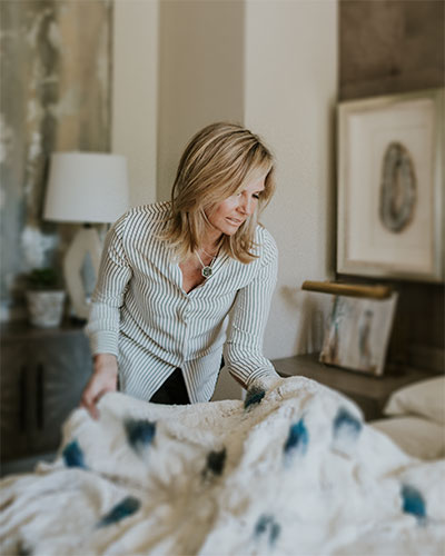
Anne-Marie stands at the intersection of design, building, and remodeling.
Anne-Marie's blending of modern form and function with authentic vintage detail creates energy, fresh simplicity, and livability.
I believe that the most challenging design is the mix
of old and new, soft in contrast to hard edged. But this “ mix" is the most satisfying of all. Like classic Ballet and photography, the classics are where we draw from. By cutting into the modern with softness, warmth and gentile edges, you provide livable "organic modern".
AMB's homes entail organic ingredients such as dry white oak floors, walnut, bronze, woolen textiles, and rich hues to create what she calls the "real factor"—leaving no space untouched by a sense of natural. She strives to create environments that raise the quality of life of those who live there.
I like the woods used on flooring and and furniture to be undercooked, un-lacquered, and natural. I want to see what makes the wood, wood!
I see a continued affection for “the mix” with metal finishes in our kitchen design, furniture, bathroom fixtures, lighting, cabinet hardware and accessories. Bronze, brass, satin brass, polished and black nickel now all work together and are interchangeable.
This is how I have defined Organic Modern in my work, the mix of the slick with the natural, toning down the modern enough to make it livable. Its “the mix” that provides the essential sense of history and charm.
Best known for early collaboration with architects, builders, and clients, Anne-Marie delivers a detailed, seamless result by bringing a grassroots approach to every project. With over 25 years of experience, she eliminates the fear factor when embarking on what is sure to be a profoundly satisfying experience.
Anne-Marie's work can be found in California, New York City, Connecticut, Memphis, and throughout her home state of Utah. Her list of over 200 clients includes NFL Hall of Fame quarterback Steve Young, CBS sportscaster Jim Nantz, and professional golfer Johnny Miller. AMB Design enjoys a large variety of style and scope, with projects ranging from the prestigious St. Regis in Deer Valley to The Silverado Resort in Napa Valley to a country manor home in rural Connecticut and the 50k square-foot Fusion-io headquarters.
Design Philosophy
I truly believe that “If you invest in beauty it will stay with you all the days of your life,” Frank Lloyd Wright.
I grew up with parents who had day jobs, but on the side they designed and built a new home every time we moved (9 times before starting high school). There was never a time when samples were not rolling around in our car… Rarely a time when house plans were not a part of the dining table conversation. I literally grew up immersed in aesthetics and “the build” with parents who had no training but a whole lot of raw courage. They taught me how to “envision” without even knowing it.
FIRST JOB
I got my first design project when I was 12 years old. I wanted to redo my bedroom turning it into a complete safari theme with sheeting that included lions and leaves and natural grass wall covering. After a little begging, my parents agreed to match me dollar for dollar. So, I had to hit the streets doing the only job I could find for a 12 year old...selling Avon products door to door. Soon I was able to style and furnish my first project which for me was the room of my dreams. I can’t tell you how much I wish I still had the bamboo swing chair today. Always remember what goes around comes around in design.
At the heart of what we do is: “CARE ABOUT WHAT WE SEE” because ultimately what we see around us influences the way we feel.
No, we are not saving lives, but, without a doubt, we are influencing the lives people live. How many professions out there are in the business of delivering dreams? Ultimately, We are a part of creating a space that inspires others to raise their own bars and live a more beautiful life.
TRENDS
Hearing the word “trends” usually causes me a little pause. “Trendy” seems to be the anti-thesis of words like timeless and authentic which I strive to include in my work. Something about the word "trendy" feels like I am literally selling out.
But trends are actually:
Nothing more than a subtle wave.
An undercurrent that moves us forward.
Immeasurable.
Trends keep us considering new ideas.
Striving to be a step in front of ourselves.
Doesn’t always mean a compromise of integrity.
Trends can fuel the re-invention of something classic making it fresh and improved.
In less than 30 years, we have gone from yellow brass to polished nickel and now back to brass. Only this time, what’s amazing about it is that we have gone all the way back to classic, unlaquered brass. Undercooked, rubbed not sprayed, natural and used, not perfect and new.
We trade the polished brass unequivocally for the feel of unlaquered, the zinc over the shiny copper, the raw steel over the powder coated any day.
So perhaps brass IS trendy, but timeless and here to stay. Its been re-introduced in a better way. Because REAL is always on trend.
MAXIMILISM
In fact, the new trend is MAXIMILISM, not minimalism. There is more emphasis on design freedoms.
Instead of relying on conventions or pre-determined sets of rules for a particular aesthetic, we have the ability to create a one-of-a-kind space that suits who our clients really are.
Just like fashion and art, where I draw many of my cues, consumers want to express themselves and “maximalism” allows them to do that. In a time when everything tends to look the same at RH MODERN and Instagram——it’s exciting to see this new trend catch on.
People are ready to get REAL. This explains the realness in the finishes but also it points to celebrating the way people actually live.
TEXTURES
I rely on texture instead of color to create contrast. Mixing opposing textures provides energy! Go Ahead and merge raw goods with finished. Dirty with clean. Texture with refined.
A contradiction of materials is invaluable to warm, to soothe, to remain informal and comfortable.
Real Bronze Accents are a must:
COLOR
When it comes to Color : “Greige" is now so clearly a part of our DNA, a safe haven, but it's really the new neutral where white once was. From there we go as far and wide as we wish with the undercurrent of calm, soothing tones.
BREAK DOWN THE BARRIERS - KITCHENS
No longer craving spotless kitchens demanding to be kept clean instead the kitchen is the new family room. We are craving homey, lounge style kitchens/relate more to a family and friends gathering spot than to a work space. The kitchen remains the heart of the home so it must speak to comfort, warmth, luxe appliances and electronics along with self service glassware and dishes, honed countertops, and a coffee bar islands where a couple can dine and actually look at one another.
Make it scullery, use the stuff you sit out, no fake props and above all lay out your kitchen in a way that allows others to help do the cooking.
DETAILS
Details come in the smallest packages and they make all the difference.
We are known for the use of the QUIRK MITER..what is that? It’s a masonry term used to infer a dato or a space. The quirk shows up on countertops between the cabinet and the start of the slab. It shows up on baseboard between the base and the wall and best when it is flush. It shows up on cabinetry and door details making them more interesting than a shaker panel by far. It shows up on art work we frame…the gap allows for a shadow line to appear. This provides depth and interest. I don’t always want the quirk to be flush. I am often drawn to show off the break and push the details a bit more…exposing them, leaving them out there to be realized.
Details I live for:
Tile with deep texture
Bronze and Brass Used throughout the home on fireplace, kitchens, shelving, frames, custom surrounds, hanging rods
Countertop Profiles like the restaurant edge
Smoked Glass
Custom Mirror Shapes
Gourmet Faucets like Fantini
Wall Covering
Sublime Decorative Lighting
Out of the ordinary kitchen ranges
LIGHTING - Just light what needs to be lit
Rely on decorative lighting to do the heavy lifting.
Lighten up on the expected stuff. Like recessed cans in grid patterns, no!
Light only what needs to be lit! This is my new Mantra.
Appreciate the shadows.
Mix in track lighting, channeled light pockets. The europeans have this down, but we are getting into it now so watch for it and use it.
Utilize indirect lighting along the ceiling walls with crevices for use of LED.
CABINETRY HARDWARE
Applied hardware throughout is expected, try partnering with finger pulls and touch latches! I only want to see what is gorgeous but the mundane needs to be reduced and set back.
ACCESSORIES
Its time to curate a mix of vintage accessories and art to tell a personal story. Mixing found items, books and art into your space creates a unique and personal experience. I really don’t believe in props on shelves, let’s instead artfully fill our homes with stuff you really use.
When I start a project I imagine my client wishing to raise their own bar, to be more scullery, wanting and deserving aesthetic choices that are equally practical.
I dream the dream with them.
I believe people are more willing now to invest for a lifetime with quality first. They are willing to go smaller with more value and realize that “bigger is not better” because they want living to be, above all, an experience.
AMB DESIGN TRENDS FOR 2020
"Keep It Real" with contrasting finishes, accessories, style and the way you live in it!
Curating “the Mix” - Not choosing one or the other but curating a contrasting combination that infuses our design with energy.
Getting rid of borders PLEASE…no borders on driveways, on rugs, on paintings, on wood flooring.
Throwing a curve is a must. With the influence of modern over the past 15 years…we must make sure we don’t go too far. Yes, we all wish for simpler lines, more order within our homes even minimalism. But it’s essential to keep our living space soft and accepting of our human selves which has grace and natural shapes. Curves are not out! They are critical in modern design. Softening the modern making it livable.
Rely on texture instead of color to make your home interesting and at the same time you will have de-formalized it! Varying surfaces offers interest. We find texture more curious than color, more multi-faceted and by all means more credible over time. I’d rather see moss on the pot, wire brushing on the white oak, patina on a brass hood, movement in the pattern of the rug than I would too much color on the walls.
We are all unique and what drives our personal design for each of us is different. We believe in listening and designing for the one-of-a-kind client. Because in the end of every successful project is a home that ultimately suits and serves the client.


